45 Best 「visualization」 Books of 2025| Books Explorer
- Storytelling with Data: A Data Visualization Guide for Business Professionals
- Visualize This: The FlowingData Guide to Design, Visualization, and Statistics
- The Big Book of Dashboards: Visualizing Your Data Using Real-World Business Scenarios
- Information Dashboard Design: Displaying data for at-a-glance monitoring
- Avoiding Data Pitfalls: How to Steer Clear of Common Blunders When Working with Data and Presenting Analysis and Visualizations
- Beautiful Visualization
- The Accidental Analyst: Show Your Data Who's Boss
- The Visual Display of Quantitative Information
- Data Visualization: A Practical Introduction
- Semiology of Graphics: Diagrams, Networks, Maps

Don't simply show your data—tell a story with it! Storytelling with Data teaches you the fundamentals of data visualization and how to communicate effectively with data. You'll discover the power of storytelling and the way to make data a pivotal point in your story. The lessons in this illuminative text are grounded in theory, but made accessible through numerous real-world examples—ready for immediate application to your next graph or presentation.Storytelling is not an inherent skill, especially when it comes to data visualization, and the tools at our disposal don't make it any easier. This book demonstrates how to go beyond conventional tools to reach the root of your data, and how to use your data to create an engaging, informative, compelling story. Specifically, you'll learn how to:Understand the importance of context and audience Determine the appropriate type of graph for your situation Recognize and eliminate the clutter clouding your information Direct your audience's attention to the most important parts of your data Think like a designer and utilize concepts of design in data visualization Leverage the power of storytelling to help your message resonate with your audience Together, the lessons in this book will help you turn your data into high impact visual stories that stick with your audience. Rid your world of ineffective graphs, one exploding 3D pie chart at a time. There is a story in your data—Storytelling with Data will give you the skills and power to tell it.

Practical data design tips from a data visualization expert of the modern ageData doesn?t decrease; it is ever-increasing and can be overwhelming to organize in a way that makes sense to its intended audience. Wouldn?t it be wonderful if we could actually visualize data in such a way that we could maximize its potential and tell a story in a clear, concise manner? Thanks to the creative genius of Nathan Yau, we can. With this full-color book, data visualization guru and author Nathan Yau uses step-by-step tutorials to show you how to visualize and tell stories with data. He explains how to gather, parse, and format data and then design high quality graphics that help you explore and present patterns, outliers, and relationships. Presents a unique approach to visualizing and telling stories with data, from a data visualization expert and the creator of flowingdata.com, Nathan Yau Offers step-by-step tutorials and practical design tips for creating statistical graphics, geographical maps, and information design to find meaning in the numbers Details tools that can be used to visualize data-native graphics for the Web, such as ActionScript, Flash libraries, PHP, and JavaScript and tools to design graphics for print, such as R and Illustrator Contains numerous examples and descriptions of patterns and outliers and explains how to show themVisualize This demonstrates how to explain data visually so that you can present your information in a way that is easy to understand and appealing.From the Author: Telling Stories with DataAuthor Nathan Yau A common mistake in data design is to approach a project with a visual layout before looking at your data. This leads to graphics that lack context and provide little value. Visualize This teaches you a data-first approach. Explore what your data has to say first, and you can design graphics that mean something.Visualization and data design all come easier with practice, and you can advance your skills with every new dataset and project. To begin though, you need a proper foundation and know what tools are available to you (but not let them bog you down). I wrote Visualize This with that in mind.You'll be exposed to a variety of software and code and jump right into real-world datasets so that you can learn visualization by doing, and most importantly be able to apply what you learn to your own data.Three Data Visualization Steps:1) Ask a Question(Click Graphic to See Larger Version)When you get a dataset, it sometimes is a challenge figuring out where to start, especially when it's a large dataset. Approach your data with a simple curiosity or a question that you want answered, and go from there.2) Explore Your Data(Click Graphic to See Larger Version)A simple curiosity often leads to more questions, which are a good guide for what stories to dig into. What variables are related to each other? Can you see changes over time? Are there any features in the data that stand out? Find out all you can about your data, because the more you know what's behind the numbers, the better story you can tell.3) Visualize Your Data(Click Graphic to See Larger Version)Once you know the important parts of your data, you can design graphics the best way you see fit. Use shapes, colors, and sizes that make sense and help tell your story clearly to readers. While the base of your charts and graphs will share many of the same properties – bars, slices, dots, and lines – the final design elements will and should vary by your unique dataset.

The definitive reference book with real-world solutions you won't find anywhere elseThe Big Book of Dashboards presents a comprehensive reference for those tasked with building or overseeing the development of business dashboards.Comprising dozens of examples that address different industries and departments (healthcare, transportation, finance, human resources, marketing, customer service, sports, etc.) and different platforms (print, desktop, tablet, smartphone, and conference room display) The Big Book of Dashboards is the only book that matches great dashboards with real-world business scenarios.By organizing the book based on these scenarios and offering practical and effective visualization examples, The Big Book of Dashboards will be the trusted resource that you open when you need to build an effective business dashboard.In addition to the scenarios there's an entire section of the book that is devoted to addressing many practical and psychological factors you will encounter in your work. It's great to have theory and evidenced-based research at your disposal, but what will you do when somebody asks you to make your dashboard 'cooler' by adding packed bubbles and donut charts?The expert authors have a combined 30-plus years of hands-on experience helping people in hundreds of organizations build effective visualizations. They have fought many 'best practices' battles and having endured bring an uncommon empathy to help you, the reader of this book, survive and thrive in the data visualization world.A well-designed dashboard can point out risks, opportunities, and more; but common challenges and misconceptions can make your dashboard useless at best, and misleading at worst. The Big Book of Dashboards gives you the tools, guidance, and models you need to produce great dashboards that inform, enlighten, and engage.


Avoid data blunders and create truly useful visualizations Avoiding Data Pitfalls is a reputation-saving handbook for those who work with data, designed to help you avoid the all-too-common blunders that occur in data analysis, visualization, and presentation. Plenty of data tools exist, along with plenty of books that tell you how to use them―but unless you truly understand how to work with data, each of these tools can ultimately mislead and cause costly mistakes. This book walks you step by step through the full data visualization process, from calculation and analysis through accurate, useful presentation. Common blunders are explored in depth to show you how they arise, how they have become so common, and how you can avoid them from the outset. Then and only then can you take advantage of the wealth of tools that are out there―in the hands of someone who knows what they're doing, the right tools can cut down on the time, labor, and myriad decisions that go into each and every data presentation. \nWorkers in almost every industry are now commonly expected to effectively analyze and present data, even with little or no formal training. There are many pitfalls―some might say chasms―in the process, and no one wants to be the source of a data error that costs money or even lives. This book provides a full walk-through of the process to help you ensure a truly useful result. \n\nDelve into the "data-reality gap" that grows with our dependence on data Learn how the right tools can streamline the visualization process Avoid common mistakes in data analysis, visualization, and presentation Create and present clear, accurate, effective data visualizations \nTo err is human, but in today's data-driven world, the stakes can be high and the mistakes costly. Don't rely on "catching" mistakes, avoid them from the outset with the expert instruction in Avoiding Data Pitfalls.

Visualization is the graphic presentation of data -- portrayals meant to reveal complex information at a glance. Think of the familiar map of the New York City subway system, or a diagram of the human brain. Successful visualizations are beautiful not only for their aesthetic design, but also for elegant layers of detail that efficiently generate insight and new understanding.This book examines the methods of two dozen visualization experts who approach their projects from a variety of perspectives -- as artists, designers, commentators, scientists, analysts, statisticians, and more. Together they demonstrate how visualization can help us make sense of the world. Explore the importance of storytelling with a simple visualization exercise Learn how color conveys information that our brains recognize before we're fully aware of it Discover how the books we buy and the people we associate with reveal clues to our deeper selves Recognize a method to the madness of air travel with a visualization of civilian air traffic Find out how researchers investigate unknown phenomena, from initial sketches to published papersContributors include:Nick Bilton, Michael E. Driscoll, Jonathan Feinberg, Danyel Fisher, Jessica Hagy, Gregor Hochmuth, Todd Holloway, Noah Iliinsky, Eddie Jabbour, Valdean Klump, Aaron Koblin, Robert Kosara, Valdis Krebs, JoAnn Kuchera-Morin et al., Andrew Odewahn, Adam Perer, Anders Persson, Maximilian Schich, Matthias Shapiro, Julie Steele, Moritz Stefaner, Jer Thorp, Fernanda Viegas, Martin Wattenberg, and Michael Young.

Are you drowning in a sea of data? Would you like to take control of your data and analysis to quickly answer your business questions and make critical decisions? Do you want to confidently present results and solutions to managers, colleagues, clients and the public?If so, you are an Accidental Analyst! Although you didn't plan for a career as a data analyst, you're now in a position where you have to analyze data to be successful. Whether you've been working with data for a few years or are just getting started, you can learn how to analyze your data to find answers to real-world questions. Even if you're an expert, you'll find creative ideas on how to work with accidental analysts. Using illustrated examples, we'll walk you through a clear, step-by-step framework that we call The Seven C's of Data Analysis.Read this book for inspiration, ideas and confidence to begin tackling the problems you face at work. Keep it by your desk as a reference on how to organize, analyze and display your data using best practices of visual analytics. Don't worry, you can continue to use your favorite spreadsheet or data analysis software—this information is not tied to any particular application. Throughout the book, we also include tips, tricks, and shortcuts that took years of analyzing data to discover and understand!This book is valuable for users of Microsoft Excel, Microsoft Access, Business Objects, Cognos, JMP, Microstrategy, Panopticon Software, QlikView, R, SAS, SPSS, Tableau Software or Tibco Spotfire.Please visit us at www.AccidentalAnalyst.com for articles, our free newsletter and upcoming events."This is a wonderful book, filled with practical advice.... a great resource for building analytical prowess."Stephen FewBest-selling author of "Show Me the Numbers" and "Now You See It""Finally, a book that clearly explains the fundamentals of business analytics!"Tim LatendressFinancial Analyst"This book is an amazing resource for regular business people."Diego SaenzPresident, Petplace and former CIO of Pepsi Latin AmericaIn his talk at the 2012 Tableau Conference, Pat Hanrahan, PhD,explained that the book changed how he thinks about analytics andinspired him to develop a new approach to teaching.Professor at Stanford UniversityCo-founder of Tableau and PixarTwo Academy AwardsEileen McDaniel, PhDCo-Founder and Managing Partner of Freakalytics, specializing in educational materials and analytical training with the goal of empowering people to get the most out of their data and take decisive action in their daily work. Her unique experience in science and business inspired her to adapt the scientific method for business, resulting in the Seven C's framework. She also is co-author of Rapid Graphs with Tableau and the Rapid Dashboards Reference Card and App.Stephen McDanielCo-Founder and Principal Data Scientist of Freakalytics. He has over 25 years of experience as a statistician, analyst, data architect, instructor, data miner and software innovator. He has been a faculty member at The Data Warehouse Institute (TDWI) and at The American Marketing Association. He is lead author of SAS for Dummies and has worked with over 100 organizations including Netflix, SAS, Tableau, UC-Berkeley, Duke and the US Navy.

The classic book on statistical graphics, charts, tables. Theory and practice in the design of data graphics, 250 illustrations of the best (and a few of the worst) statistical graphics, with detailed analysis of how to display data for precise, effective, quick analysis. Design of the high-resolution displays, small multiples. Editing and improving graphics. The data-ink ratio. Time-series, relational graphics, data maps, multivariate designs. Detection of graphical deception: design variation vs. data variation. Sources of deception. Aesthetics and data graphical displays. This is the second edition of The Visual Display of Quantitative Information. This edition provides excellent color reproductions of the many graphics of William Playfair, adds color to other images, and includes all the changes and corrections accumulated during 17 printings of the first edition.

An accessible primer on how to create effective graphics from data\nThis book provides students and researchers a hands-on introduction to the principles and practice of data visualization. It explains what makes some graphs succeed while others fail, how to make high-quality figures from data using powerful and reproducible methods, and how to think about data visualization in an honest and effective way.\nData Visualization builds the reader’s expertise in ggplot2, a versatile visualization library for the R programming language. Through a series of worked examples, this accessible primer then demonstrates how to create plots piece by piece, beginning with summaries of single variables and moving on to more complex graphics. Topics include plotting continuous and categorical variables; layering information on graphics; producing effective “small multiple” plots; grouping, summarizing, and transforming data for plotting; creating maps; working with the output of statistical models; and refining plots to make them more comprehensible.\nEffective graphics are essential to communicating ideas and a great way to better understand data. This book provides the practical skills students and practitioners need to visualize quantitative data and get the most out of their research findings.\n\nProvides hands-on instruction using R and ggplot2\n\nShows how the “tidyverse” of data analysis tools makes working with R easier and more consistent\n\nIncludes a library of data sets, code, and functions\n\n

Originally published in French in 1967, Semiology of Graphics holds a significant place in the theory of information design. Founded on Jacques Bertin’s practical experience as a cartographer, Part One of this work is an unprecedented attempt to synthesize principles of graphic communication with the logic of standard rules applied to writing and topography. Part Two brings Bertin’s theory to life, presenting a close study of graphic techniques including shape, orientation, color, texture, volume, and size in an array of more than 1,000 maps and diagrams.

“If you can’t explain it simply, you don’t understand it well enough.”—Albert EinsteinOur everyday lives are filled with a massive flow of information that we must interpret in order to understand the world we live in. Considering the complex variety of data floating around us, sometimes the best—or even only—way to communicate is visually. This unique book presents a fascinating perspective on the subject, highlighting the work of the masters of the profession, creators of breakthroughs that have changed the way we communicate. Information Graphics has been conceived and designed not just for graphics professionals, but for anyone interested in the history and practice of communicating visually.The in-depth introductory section, illustrated with over 60 images (each accompanied by an explanatory caption), features essays by Sandra Rendgen, Paolo Ciuccarelli, Richard Saul Wurman, and Simon Rogers. Looking back all the way to primitive cave paintings as a means of communication, this section gives readers an excellent overview of the subject. The second part of the book is entirely dedicated to contemporary works by today’s most renowned professionals, presenting 200 graphics projects, with over 400 examples—each with a fact sheet and an explanation of methods and objectives—divided into chapters by the topics Location, Time, Category, and Hierarchy. 200 projects and over 400 examples of contemporary information graphics from all over the world—ranging from journalism to art, government, education, business and much moreFour essays about the development of information graphics since its beginningsExclusive poster (673 x 475 mm / 26.5 x 18.7 in) by Nigel Holmes, who during his 20 years as graphics director for TIME revolutionized the way the magazine used information graphics

Now in Paperback! What does history look like? How do you draw time? Cartographies of Time is the first history of the timeline, written engagingly and with incredible visuals. The authors, both accomplished writers and historians, sketch the shifting field of graphic representations of history from the beginning of the print age through the present. They shed light on western views of history and on the complex relationship between general ideas about the course of events and the technical efforts to record and connect dates and names in the past. In addition to telling a rich, forgotten story, this book serves as a kind of grammar of historical representation, uncovering the ways in which time has been structured in thought and in images, in the Western tradition. Written for both the academically curious and the general reader, Cartographies of Time provides a set of tools for understanding the evolution and the significance of graphic representations of time both in history and in contemporary culture.

Now more than ever, content must be visual if it is to travel far. Readers everywhere are overwhelmed with a flow of data, news, and text. Visuals can cut through the noise and make it easier for readers to recognize and recall information. Yet many researchers were never taught how to present their work visually.This book details essential strategies to create more effective data visualizations. Jonathan Schwabish walks readers through the steps of creating better graphs and how to move beyond simple line, bar, and pie charts. Through more than five hundred examples, he demonstrates the do’s and don’ts of data visualization, the principles of visual perception, and how to make subjective style decisions around a chart’s design. Schwabish surveys more than eighty visualization types, from histograms to horizon charts, ridgeline plots to choropleth maps, and explains how each has its place in the visual toolkit. It might seem intimidating, but everyone can learn how to create compelling, effective data visualizations. This book will guide you as you define your audience and goals, choose the graph that best fits for your data, and clearly communicate your message.

Never has it been more essential to work in the world of data. Scholars and students need to be able to analyze, design and curate information into useful tools of communication, insight and understanding. This book is the starting point in learning the process and skills of data visualization, teaching the concepts and skills of how to present data and inspiring effective visual design. Benefits of this book: \nA flexible step-by-step journey that equips you to achieve great data visualization A curated collection of classic and contemporary examples, giving illustrations of good and bad practice Examples on every page to give creative inspiration Illustrations of good and bad practice show you how to critically evaluate and improve your own work Advice and experience from the best designers in the field Loads of online practical help, checklists, case studies and exercises make this the most comprehensive text available

Visual Thinking brings the science of perception to the art of design. Designers increasingly need to present information in ways that aid their audience’s thinking process. Fortunately, results from the relatively new science of human visual perception provide valuable guidance.In this book, Colin Ware takes what we now know about perception, cognition, and attention and transforms it into concrete advice that designers can directly apply. He demonstrates how designs can be considered as tools for cognition – extensions of the viewer’s brain in much the same way that a hammer is an extension of the user’s hand. The book includes hundreds of examples, many in the form of integrated text and full-color diagrams.Experienced professional designers and students alike will learn how to maximize the power of the information tools they design for the people who use them. Presents visual thinking as a complex process that can be supported in every stage using specific design techniques Provides practical, task-oriented information for designers and software developers charged with design responsibilities Includes hundreds of examples, many in the form of integrated text and full-color diagrams Steeped in the principles of “active vision, which views graphic designs as cognitive tools
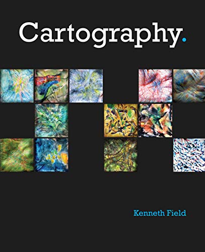
Winner of the 2019 International Cartographic Conference – Educational Products award A lavishly illustrated reference guide, Cartography. by Kenneth Field is an inspiring and creative companion along the nonlinear journey toward making a great map. This sage compendium for contemporary mapmakers distills the essence of cartography into useful topics, organized for convenience in finding the specific idea or method you need. Unlike books targeted to deep scholarly discourse of cartographic theory, this book provides sound, visually compelling information that translates into practical and useful tools for modern mapmaking. At the intersection of science and art, this book serves as a guidepost for designing an accurate and effective map.
The classic book on statistical graphics, charts, tables. Theory and practice in the design of data graphics, 250 illustrations of the best (and a few of the worst) statistical graphics, with detailed analysis of how to display data for precise, effective, quick analysis. Design of the high-resolution displays, small multiples. Editing and improving graphics. The data-ink ratio. Time-series, relational graphics, data maps, multivariate designs. Detection of graphical deception: design variation vs. data variation. Sources of deception. Aesthetics and data graphical displays. This is the second edition of The Visual Display of Quantitative Information. This edition provides excellent color reproductions of the many graphics of William Playfair, adds color to other images, and includes all the changes and corrections accumulated during 17 printings of the first edition.

Data visualization is an essential means of making visible the invisible patterns that surround us, and of seeing beyond the numbers. In Data Sketches, Nadieh Bremer and Shirley Wu document the deeply collaborative, deeply creative process behind 24 unique data visualization projects. Completed over the course of 12 months and spanning 12 different topics - from the Olympics to Presidents & Royals and from Movies to Myths & Legends - each pair of "wondrously eccentric" visualizations explores different technologies and forms, blurring the boundary between visualization as an exploratory tool and an art form in its own right. The book provides an intimate, behind-the-scenes account of all 24 projects - from data gathering, to sketching, to coding processes - and shares the authors' personal notes and drafts every step of the way. The book features: Detailed information on data gathering, sketching, and implementing processes, with screenshots of works-in-progress and reproductions from the authors' notebooks Never-before-published technical write-ups, with beginner-friendly explanations of core data visualization concepts Practical lessons based on the data and design challenges behind each project: the mistakes that were made and how they were overcome Full-color pages, showcasing all 24 final data visualizations An interview between the authors and series editor Tamara Munzner This book is perfect for anyone interested or working in data visualization and information design, especially those who want to take their work to the next level and are inspired by unique and compelling data-driven storytelling. Nadieh Bremer is an astronomer turned data scientist turned freelancing data visualization designer. Shirley Wu studied business and finance, graduated as a software engineer, and is now an independent data visualization designer. Connected by a mutual love for visualizing data, they bring a unique approach to visualization and refuse to be tied down by convention and available tools. The results are beautiful, innovative, and inspiring. They are both award-winning and internationally recognized data visualization designers. Their past clients include Google, UNESCO, SFMOMA, and the New York Times.

Most designers know that yellow text presented against a blue background reads clearly and easily, but how many can explain why, and what really are the best ways to help others and ourselves clearly see key patterns in a bunch of data? When we use software, access a website, or view business or scientific graphics, our understanding is greatly enhanced or impeded by the way the information is presented. This book explores the art and science of why we see objects the way we do. Based on the science of perception and vision, the author presents the key principles at work for a wide range of applications--resulting in visualization of improved clarity, utility, and persuasiveness. The book offers practical guidelines that can be applied by anyone: interaction designers, graphic designers of all kinds (including web designers), data miners, and financial analysts.

Influence action through data! This is not a book. It is a one-of-a-kind immersive learning experience through which you can become—or teach others to be—a powerful data storyteller.Let's practice! helps you build confidence and credibility to create graphs and visualizations that make sense and weave them into action-inspiring stories. Expanding upon best seller storytelling with data's foundational lessons, Let's practice! delivers fresh content, a plethora of new examples, and over 100 hands-on exercises. Author and data storytelling maven Cole Nussbaumer Knaflic guides you along the path to hone core skills and become a well-practiced data communicator. Each chapter includes:● Practice with Cole: exercises based on real-world examples first posed for you to consider and solve, followed by detailed step-by-step illustration and explanation● Practice on your own: thought-provoking questions and even more exercises to be assigned or worked through individually, without prescribed solutions● Practice at work: practical guidance and hands-on exercises for applying storytelling with data lessons on the job, including instruction on when and how to solicit useful feedback and refine for greater impactThe lessons and exercises found within this comprehensive guide will empower you to master—or develop in others—data storytelling skills and transition your work from acceptable to exceptional. By investing in these skills for ourselves and our teams, we can all tell inspiring and influential data stories!

Be heard. Change minds. Get people to act. (Inspire them to clap.) Whether presenting in a meeting, delivering a keynote on stage, or simply talking with your colleagues about your latest project, you play a critical role in how information is shared. You determine whether people engage, understand, and take action.In storytelling with you, bestselling author and world-renowned speaker Cole Nussbaumer Knaflic prepares you to develop your story and deliver it with prowess. She unlocks the secrets that have propelled her from self-described introvert to sought-after presenter, distilling lessons learned into this immensely powerful and practical guide.The journey starts by building the foundation for effective communication: gaining understanding of your audience and message. You'll then learn to transform your ideas into compelling stories and illustrative content Once the materials are set, you'll turn your attention inward and explore strategies to hone your delivery and communicate with confidence, preparing you for exceptional meetings and knockout presentations.Give your hard work a voice and amplify your impact by communicating in a way that makes people want to listen and respond—storytelling with you will help you do it.

"If you can't explain it simply, you don't understand it well enough." --Albert Einstein Our everyday lives are filled with a massive flow of information that we must interpret in order to understand the world we live in. Considering the complex variety of data floating around us, sometimes the best--or even only--way to communicate is visually. This unique book presents a fascinating perspective on the subject, highlighting the work of the masters of the profession, creators of breakthroughs that have changed the way we communicate. Information Graphics has been conceived and designed not just for graphics professionals, but for anyone interested in the history and practice of communicating visually. The in-depth introductory section, illustrated with over 60 images (each accompanied by an explanatory caption), features essays by Sandra Rendgen, Paolo Ciuccarelli, Richard Saul Wurman, and Simon Rogers. Looking back all the way to primitive cave paintings as a means of communication, this section gives readers an excellent overview of the subject. The second part of the book is entirely dedicated to contemporary works by today's most renowned professionals, presenting 200 graphics projects, with over 400 examples--each with a fact sheet and an explanation of methods and objectives--divided into chapters by the topics Location, Time, Category, and Hierarchy. Includes: 200 projects and over 400 examples of contemporary information graphics from all over the world--ranging from journalism to art, government, education, business and much more Four essays about the development of information graphics since its beginnings

Effective visualization is the best way to communicate information from the increasingly large and complex datasets in the natural and social sciences. But with the increasing power of visualization software today, scientists, engineers, and business analysts often have to navigate a bewildering array of visualization choices and options.\nThis practical book takes you through many commonly encountered visualization problems, and it provides guidelines on how to turn large datasets into clear and compelling figures. What visualization type is best for the story you want to tell? How do you make informative figures that are visually pleasing? Author Claus O. Wilke teaches you the elements most critical to successful data visualization.\n\nExplore the basic concepts of color as a tool to highlight, distinguish, or represent a value\nUnderstand the importance of redundant coding to ensure you provide key information in multiple ways\nUse the book’s visualizations directory, a graphical guide to commonly used types of data visualizations\nGet extensive examples of good and bad figures\nLearn how to use figures in a document or report and how employ them effectively to tell a compelling story\n

Datavizthe new language of businessA good visualization can communicate the nature and potential impact of information and ideas more powerfully than any other form of communication.For a long time dataviz” was left to specialistsdata scientists and professional designers. No longer. A new generation of tools and massive amounts of available data make it easy for anyone to create visualizations that communicate ideas far more effectively than generic spreadsheet charts ever could.What’s more, building good charts is quickly becoming a need-to-have skill for managers. If you’re not doing it, other managers are, and they’re getting noticed for it and getting credit for contributing to your company’s success.In Good Charts, dataviz maven Scott Berinato provides an essential guide to how visualization works and how to use this new language to impress and persuade. Dataviz today is where spreadsheets and word processors were in the early 1980son the cusp of changing how we work. Berinato lays out a system for thinking visually and building better charts through a process of talking, sketching, and prototyping.This book is much more than a set of static rules for making visualizations. It taps into both well-established and cutting-edge research in visual perception and neuroscience, as well as the emerging field of visualization science, to explore why good charts (and bad ones) create feelings behind our eyes.” Along the way, Berinato also includes many engaging vignettes of dataviz pros, illustrating the ideas in practice.Good Charts will help you turn plain, uninspiring charts that merely present information into smart, effective visualizations that powerfully convey ideas.

Master the art and science of data storytelling―with frameworks and techniques to help you craft compelling stories with data. The ability to effectively communicate with data is no longer a luxury in today’s economy; it is a necessity. Transforming data into visual communication is only one part of the picture. It is equally important to engage your audience with a narrative―to tell a story with the numbers. Effective Data Storytelling will teach you the essential skills necessary to communicate your insights through persuasive and memorable data stories. Narratives are more powerful than raw statistics, more enduring than pretty charts. When done correctly, data stories can influence decisions and drive change. Most other books focus only on data visualization while neglecting the powerful narrative and psychological aspects of telling stories with data. Author Brent Dykes shows you how to take the three central elements of data storytelling―data, narrative, and visuals―and combine them for maximum effectiveness. Taking a comprehensive look at all the elements of data storytelling, this unique book will enable you to: \nTransform your insights and data visualizations into appealing, impactful data stories Learn the fundamental elements of a data story and key audience drivers Understand the differences between how the brain processes facts and narrative Structure your findings as a data narrative, using a four-step storyboarding process Incorporate the seven essential principles of better visual storytelling into your work Avoid common data storytelling mistakes by learning from historical and modern examples \nEffective Data Storytelling: How to Drive Change with Data, Narrative and Visuals is a must-have resource for anyone who communicates regularly with data, including business professionals, analysts, marketers, salespeople, financial managers, and educators.

Data visualization is an efficient and effective medium for communicating large amounts of information, but the design process can often seem like an unexplainable creative endeavor. This concise book aims to demystify the design process by showing you how to use a linear decision-making process to encode your information visually. Delve into different kinds of visualization, including infographics and visual art, and explore the influences at work in each one. Then learn how to apply these concepts to your design process. Learn data visualization classifications, including explanatory, exploratory, and hybrid Discover how three fundamental influences-the designer, the reader, and the data-shape what you create Learn how to describe the specific goal of your visualization and identify the supporting data Decide the spatial position of your visual entities with axes Encode the various dimensions of your data with appropriate visual properties, such as shape and color See visualization best practices and suggestions for encoding various specific data types

Talk. Sketch. Prototype. Repeat.You know right away when you see an effective chart or graphic. It hits you with an immediate sense of its meaning and impact. But what actually makes it clearer, sharper, and more effective? If you're ready to create your own "good charts"--data visualizations that powerfully communicate your ideas and research and that advance your career—the Good Charts Workbook is the hands-on guide you've been looking for.The original Good Charts changed the landscape by helping readers understand how to think visually and by laying out a process for creating powerful data visualizations. Now, the Good Charts Workbook provides tools, exercises, and practical insights to help people in all kinds of enterprises gain the skills they need to get started.Harvard Business Review Senior Editor and dataviz expert Scott Berinato leads you, step-by-step, through the key challenges in creating good charts—controlling color, crafting for clarity, choosing chart types, practicing persuasion, capturing concepts—with warm-up exercises and mini-challenges for each. The Workbook includes helpful prompts and reminders throughout, as well as white space for users to practice the Good Charts talk-sketch-prototype process.Good Charts Workbook is the must-have manual for better understanding the dataviz around you and for creating better charts to make your case more effectively.

A leading data visualization expert explores the negative―and positive―influences that charts have on our perception of truth.\nToday, public conversations are increasingly driven by numbers. While charts, infographics, and diagrams can make us smarter, they can also deceive―intentionally or unintentionally. To be informed citizens, we must all be able to decode and use the visual information that politicians, journalists, and even our employers present us with each day. Demystifying an essential new literacy for our data-driven world, How Charts Lie examines contemporary examples ranging from election result infographics to global GDP maps and box office record charts, as well as an updated afterword on the graphics of the COVID-19 pandemic. 175 illustrations

Unlike any time before in our lives, we have access to vast amounts of free information. With the right tools, we can start to make sense of all this data to see patterns and trends that would otherwise be invisible to us. By transforming numbers into graphical shapes, we allow readers to understand the stories those numbers hide. In this practical introduction to understanding and using information graphics, you’ll learn how to use data visualizations as tools to see beyond lists of numbers and variables and achieve new insights into the complex world around us. Regardless of the kind of data you’re working with–business, science, politics, sports, or even your own personal finances–this book will show you how to use statistical charts, maps, and explanation diagrams to spot the stories in the data and learn new things from it. You’ll also get to peek into the creative process of some of the world’s most talented designers and visual journalists, including Condé Nast Traveler’s John Grimwade, National Geographic Magazine’s Fernando Baptista, The New York Times’ Steve Duenes, The Washington Post’s Hannah Fairfield, Hans Rosling of the Gapminder Foundation, Stanford’s Geoff McGhee, and European superstars Moritz Stefaner, Jan Willem Tulp, Stefanie Posavec, and Gregor Aisch. The book also includes a DVD-ROM containing over 90 minutes of video lessons that expand on core concepts explained within the book and includes even more inspirational information graphics from the world’s leading designers. The first book to offer a broad, hands-on introduction to information graphics and visualization, The Functional Art reveals: • Why data visualization should be thought of as “functional art” rather than fine art • How to use color, type, and other graphic tools to make your information graphics more effective, not just better looking • The science of how our brains perceive and remember information • Best practices for creating interactive information graphics • A comprehensive look at the creative process behind successful information graphics • An extensive gallery of inspirational work from the world’s top designers and visual artistsOn the DVD-ROM:In this introductory video course on information graphics, Alberto Cairo goes into greater detail with even more visual examples of how to create effective information graphics that function as practical tools for aiding perception. You’ll learn how to: incorporate basic design principles in your visualizations, create simple interfaces for interactive graphics, and choose the appropriate type of graphic forms for your data. Cairo also deconstructs successful information graphics from The New York Times and National Geographic magazine with sketches and images not shown in the book.

The definitive guide to the graphic presentation of information. In today’s data-driven world, professionals need to know how to express themselves in the language of graphics effectively and eloquently. Yet information graphics is rarely taught in schools or is the focus of on-the-job training. Now, for the first time, Dona M. Wong, a student of the information graphics pioneer Edward Tufte, makes this material available for all of us. In this book, you will learn: \nto choose the best chart that fits your data;\nthe most effective way to communicate with decision makers when you have five minutes of their time;\nhow to chart currency fluctuations that affect global business;\nhow to use color effectively;\nhow to make a graphic “colorful” even if only black and white are available.\n\nThe book is organized in a series of mini-workshops backed up with illustrated examples, so not only will you learn what works and what doesn’t but also you can see the dos and don’ts for yourself. This is an invaluable reference work for students and professional in all fields. 500+ illustrations

How do we create new ways of looking at the world? Join award-winning data storyteller RJ Andrews as he pushes beyond the usual how-to, and takes you on an adventure into the rich art of informing. Creating Info We Trust is a craft that puts the world into forms that are strong and true. It begins with maps, diagrams, and charts ― but must push further than dry defaults to be truly effective. How do we attract attention? How can we offer audiences valuable experiences worth their time? How can we help people access complexity? Dark and mysterious, but full of potential, data is the raw material from which new understanding can emerge. Become a hero of the information age as you learn how to dip into the chaos of data and emerge with new understanding that can entertain, improve, and inspire. Whether you call the craft data storytelling, data visualization, data journalism, dashboard design, or infographic creation ― what matters is that you are courageously confronting the chaos of it all in order to improve how people see the world. Info We Trust is written for everyone who straddles the domains of data and people: data visualization professionals, analysts, and all who are enthusiastic for seeing the world in new ways. This book draws from the entirety of human experience, quantitative and poetic. It teaches advanced techniques, such as visual metaphor and data transformations, in order to create more human presentations of data. It also shows how we can learn from print advertising, engineering, museum curation, and mythology archetypes. This human-centered approach works with machines to design information for people. Advance your understanding beyond by learning from a broad tradition of putting things “in formation” to create new and wonderful ways of opening our eyes to the world. Info We Trust takes a thoroughly original point of attack on the art of informing. It builds on decades of best practices and adds the creative enthusiasm of a world-class data storyteller. Info We Trust is lavishly illustrated with hundreds of original compositions designed to illuminate the craft, delight the reader, and inspire a generation of data storytellers.

Describes design strategies - the proper arrangement in space and time of images, words, and numbers - for presenting information about motion, process, mechanism, cause, and effect. Examines the logic of depicting quantitative evidence.

The definitive guide to the graphic presentation of information. In today’s data-driven world, professionals need to know how to express themselves in the language of graphics effectively and eloquently. Yet information graphics is rarely taught in schools or is the focus of on-the-job training. Now, for the first time, Dona M. Wong, a student of the information graphics pioneer Edward Tufte, makes this material available for all of us. In this book, you will learn: \nto choose the best chart that fits your data;\nthe most effective way to communicate with decision makers when you have five minutes of their time;\nhow to chart currency fluctuations that affect global business;\nhow to use color effectively;\nhow to make a graphic “colorful” even if only black and white are available.\n\nThe book is organized in a series of mini-workshops backed up with illustrated examples, so not only will you learn what works and what doesn’t but also you can see the dos and don’ts for yourself. This is an invaluable reference work for students and professional in all fields. 2-color; 500+ illustrations, 16 pages of color

Make information memorable with creative visual designtechniques\nResearch shows that visual information is more quickly andeasily understood, and much more likely to be remembered. Thisinnovative book presents the design process and the best softwaretools for creating infographics that communicate. Including aspecial section on how to construct the increasingly popularinfographic resume, the book offers graphic designers, marketers,and business professionals vital information on the most effectiveways to present data.\n\nExplains why infographics and data visualizations work\nShares the tools and techniques for creating greatinfographics\nCovers online infographics used for marketing, including socialmedia and search engine optimization (SEO)\nShows how to market your skills with a visual, infographicresume\nExplores the many internal business uses of infographics,including board meeting presentations, annual reports, consumerresearch statistics, marketing strategies, business plans, andvisual explanations of products and services to your customers\n\nWith Cool Infographics, you'll learn to createinfographics to successfully reach your target audience and tellclear stories with your data.

Information visualization is a language. Like any language, it can be used for multiple purposes. A poem, a novel, and an essay all share the same language, but each one has its own set of rules. The same is true with information visualization: a product manager, statistician, and graphic designer each approach visualization from different perspectives. Data at Work was written with you, the spreadsheet user, in mind. This book will teach you how to think about and organize data in ways that directly relate to your work, using the skills you already have. In other words, you don’t need to be a graphic designer to create functional, elegant charts: this book will show you how. Although all of the examples in this book were created in Microsoft Excel, this is not a book about how to use Excel. Data at Work will help you to know which type of chart to use and how to format it, regardless of which spreadsheet application you use and whether or not you have any design experience. In this book, you’ll learn how to extract, clean, and transform data; sort data points to identify patterns and detect outliers; and understand how and when to use a variety of data visualizations including bar charts, slope charts, strip charts, scatter plots, bubble charts, boxplots, and more. Because this book is not a manual, it never specifies the steps required to make a chart, but the relevant charts will be available online for you to download, with brief explanations of how they were created.

In this sequel to the bestselling book The Visual Miscellaneum, author David McCandless uses stunning and unique visuals to reveal unexpected insights into how the world really works.\nEvery day, every hour, every minute we are bombarded with information, from television, from newspapers, from the Internet, we’re steeped in it. We need a way to relate to it. Enter David McCandless and his stunning infographics, simple, elegant ways to interact with information too complex or abstract to grasp any way but visually. McCandless creates visually stunning displays that blend the facts with their connections, contexts, and relationships, making information meaningful, entertaining, and beautiful. And his genius is as much in finding fresh ways to provocatively combine datasets as it is in finding new ways to show the results.\nKnowledge is Beautiful is a fascinating spin through the world of visualized data, all of it bearing the hallmark of David McCandless’s boundary-breaking, signature style. The captivating follow-up to the bestseller The Visual Miscellaneum, Knowledge is Beautiful offers a deeper, more ranging look at the world and its history, with more connectivity between the pages, a greater exploration of causes and consequences, and a more inclusive global outlook. With a portion of its content crowd-sourced from McCandless’s international following, Knowledge is Beautiful achieves a revolutionary and democratic look at the key issues from questions on history and politics, the facts of science, streams of literature, and much more.\nThis is a project that will truly push the boundaries of books everywhere, providing insights into our world in a way never seen before.

Product Description In Data Sketches, Nadieh Bremer and Shirley Wu document the deeply creative process behind 24 unique data visualization projects, and they combine this with powerful technical insights which reveal the mindset behind coding creatively. Exploring 12 different themes – from the Olympics to Presidents & Royals and from Movies to Myths & Legends – each pair of visualizations explores different technologies and forms, blurring the boundary between visualization as an exploratory tool and an artform in its own right. This beautiful book provides an intimate, behind-the-scenes account of all 24 projects and shares the authors’ personal notes and drafts every step of the way.The book features:Detailed information on data gathering, sketching, and coding data visualizations for the web, with screenshots of works-in-progress and reproductions from the authors’ notebooksNever-before-published technical write-ups, with beginner-friendly explanations of core data visualization conceptsPractical lessons based on the data and design challenges overcome during each projectFull-color pages, showcasing all 24 final data visualizationsThis book is perfect for anyone interested or working in data visualization and information design, and especially those who want to take their work to the next level and are inspired by unique and compelling data-driven storytelling. Review "The Data Sketches collaboration is a glorious tour de force: two people spur each other along a remarkable spiral of visualization creativity, and let the rest of us come along for the ride! Nadieh and Shirley share their sketches and code, experiments and explorations, reflections and realizations, eurekas and backtracks, and infectious enthusiasm. They each bring a unique vector, voice, and style to the 12 project topics; what unites them is deep technical chops and a superlative eye for design."--Tamara Munzner, Professor of Computer Science at the University of British Columbia, Chair of the Executive Committee of IEEE Visualization, Author of Visualization Analysis and Design"What a rare treat it is for Shirley and Nadieh to share their process so openly! We see not only the technical work―prototyping with real data, riffing from examples―but the circuitous emotional journey from rough concept to polished final product. Shirley and Nadieh are honest, entertaining, and insightful in their retrospectives. For anyone interested in visualization, their stories are a powerful lesson of how designs can be shaped to communicate effectively and with intent. And their openness and humility make the practice less intimidating, inviting newcomers to get started."--Mike Bostock, Creator of D3.js and Founder of Observable"The work of Nadieh Bremer & Shirley Wu is some of the most beautiful and exciting data visualization work being done today. They bring incredible aesthetics to complex data to enlighten and evoke joy in their audiences. In Data Sketches we get to see some of their best, most personal work and, more than that, we get their explanation of what inspired them and how they accomplished such amazing work. This book is a treat for both the eye and the mind."--Elijah Meeks, Executive Director of the Data Visualization Society and Author"This book brings the perfect blend of ingredients together for a nourishing recipe of inspiration and knowledge beneficial to beginners and experienced practitioners alike. Nadieh and Shirley are generational talents. Through their data visualisation work they relentlessly exhibit a wide spectrum of capabilities across the creative, editorial, analytical, and technical dimensions. Above all, they are wonderful communicators. They know how to skilfully communicate to audiences through data. And now, through this book, they share detailed stories of their process giving us the privilege of learning what, why and how they do what they do."--Andy Kirk, Data Visualisation Specialist, Author, and Editor of visuali

The acclaimed bestseller about visual problem solving-now bigger and better"There is no more powerful way to prove that we know something well than to draw a simple picture of it. And there is no more powerful way to see hidden solutions than to pick up a pen and draw out the pieces of our problem."So writes Dan Roam in The Back of the Napkin, the international bestseller that proves that a simple drawing on a humble napkin can be more powerful than the slickest PowerPoint presentation. Drawing on twenty years of experience and the latest discoveries in vision science, Roam teaches readers how to clarify any problem or sell any idea using a simple set of tools.He reveals that everyone is born with a talent for visual thinking, even those who swear they can't draw. And he shows how thinking with pictures can help you discover and develop new ideas, solve problems in unexpected ways, and dramatically improve your ability to share your insights.Take Herb Kelleher and Rollin King, who figured out how to beat the traditional hub-and-spoke airlines with a bar napkin and a pen. Three dots to represent Dallas, Houston, and San Antonio. Three arrows to show direct flights. Problem solved, and the picture made it easy to sell Southwest Airlines to investors and customers.Now with more color, bigger pictures, and additional content, this new edition does an even better job of helping you literally see the world in a new way. Join the teachers, project managers, doctors, engineers, assembly-line workers, pilots, football coaches, marine drill instructors, financial analysts, students, parents, and lawyers who have discovered the power of solving problems with pictures.

A leading data visualization expert explores the negative―and positive―influences that charts have on our perception of truth.\nWe’ve all heard that a picture is worth a thousand words, but what if we don’t understand what we’re looking at? Social media has made charts, infographics, and diagrams ubiquitous―and easier to share than ever. We associate charts with science and reason; the flashy visuals are both appealing and persuasive. Pie charts, maps, bar and line graphs, and scatter plots (to name a few) can better inform us, revealing patterns and trends hidden behind the numbers we encounter in our lives. In short, good charts make us smarter―if we know how to read them.\nHowever, they can also lead us astray. Charts lie in a variety of ways―displaying incomplete or inaccurate data, suggesting misleading patterns, and concealing uncertainty―or are frequently misunderstood, such as the confusing cone of uncertainty maps shown on TV every hurricane season. To make matters worse, many of us are ill-equipped to interpret the visuals that politicians, journalists, advertisers, and even our employers present each day, enabling bad actors to easily manipulate them to promote their own agendas.\nIn How Charts Lie, data visualization expert Alberto Cairo teaches us to not only spot the lies in deceptive visuals, but also to take advantage of good ones to understand complex stories. Public conversations are increasingly propelled by numbers, and to make sense of them we must be able to decode and use visual information. By examining contemporary examples ranging from election-result infographics to global GDP maps and box-office record charts, How Charts Lie demystifies an essential new literacy, one that will make us better equipped to navigate our data-driven world. 175 illustrations

Not a data expert? Here's an engaging and entertaining guide to interpreting and drawing insights from any chart, graph, or other data visualization you'll encounter. You're a business professional, not a data scientist. How do you make heads or tails of the data visualizations that come across your desk--let alone make critical business decisions based on the information they're designed to convey? In The Big Picture, top data visualization consultant Steve Wexler provides the tools for developing the graphical literacy you need to understand the data visualizations that are flooding your inbox--and put that data to use. Packed with the best four-color examples created in Excel, Tableau, Power BI, and Qlik, among others, this one-stop resource empowers you to extract the most important information from data visualizations quickly and accurately, act on key insights, solve problems, and make the right decisions for your organization every time.

The visualization process doesn’t happen in a vacuum; it is grounded in principles and methodologies of design, cognition, perception, and human-computer-interaction that are combined to one’s personal knowledge and creative experiences. Design for Information critically examines other design solutions —current and historic— helping you gain a larger understanding of how to solve specific problems. This book is designed to help you foster the development of a repertoire of existing methods and concepts to help you overcome design problems. Learn the ins and outs of data visualization with this informative book that provides you with a series of current visualization case studies. The visualizations discussed are analyzed for their design principles and methods, giving you valuable critical and analytical tools to further develop your design process. The case study format of this book is perfect for discussing the histories, theories and best practices in the field through real-world, effective visualizations. The selection represents a fraction of effective visualizations that we encounter in this burgeoning field, allowing you the opportunity to extend your study to other solutions in your specific field(s) of practice. This book is also helpful to students in other disciplines who are involved with visualizing information, such as those in the digital humanities and most of the sciences.

In this follow-up to his hugely popular The Book of Trees and Visual Complexity, Manuel Lima takes us on a lively tour through millennia of circular information design. Three hundred detailed and colorful illustrations from around the world cover an encyclopedic array of subjects--architecture, urban planning, fine art, design, fashion, technology, religion, cartography, biology, astronomy, and physics, all based on the circle, the universal symbol of unity, perfection, movement, and infinity. The Book of Circles juxtaposes clay trading tokens used by the ancient Sumerians with the iconic logos of twentieth-century corporations, a chart organizing seven hundred Nintendo offerings with a Victorian board game based on the travels of Nellie Bly, and a visual analysis of Stanley Kubrick's film The Shining with early celestial charts that placed the earth at the center of the universe, among a wealth of other elegant and intriguing methods for displaying information.Lima provides an authoritative history of the circle as well as a unique taxonomy of twenty-one varieties of circle diagrams, rounding out this visual feast for infographics enthusiasts.

Written by sought-after speaker, designer, and researcher Stephanie D. H. Evergreen, Effective Data Visualization shows readers how to create Excel charts and graphs that best communicate data findings. This comprehensive how-to guide functions as a set of blueprints―supported by research and the author’s extensive experience with clients in industries all over the world―for conveying data in an impactful way. Delivered in Evergreen’s humorous and approachable style, the book covers the spectrum of graph types available beyond the default options, how to determine which one most appropriately fits specific data stories, and easy steps for making the chosen graph in Excel.

Visualization methods in science andtechnology. Many new ideas and methods;many not widely known before. Excellentmethodological resource for researchworkers.
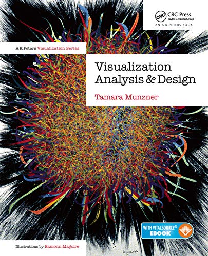
Learn How to Design Effective Visualization Systems Visualization Analysis and Design provides a systematic, comprehensive framework for thinking about visualization in terms of principles and design choices. The book features a unified approach encompassing information visualization techniques for abstract data, scientific visualization techniques for spatial data, and visual analytics techniques for interweaving data transformation and analysis with interactive visual exploration. It emphasizes the careful validation of effectiveness and the consideration of function before form. The book breaks down visualization design according to three questions: what data users need to see, why users need to carry out their tasks, and how the visual representations proposed can be constructed and manipulated. It walks readers through the use of space and color to visually encode data in a view, the trade-offs between changing a single view and using multiple linked views, and the ways to reduce the amount of data shown in each view. The book concludes with six case studies analyzed in detail with the full framework. The book is suitable for a broad set of readers, from beginners to more experienced visualization designers. It does not assume any previous experience in programming, mathematics, human–computer interaction, or graphic design and can be used in an introductory visualization course at the graduate or undergraduate level.